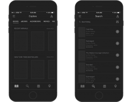
Challenge
The Chicago Public Library offers their services to thousands of people every single day. Because the UX on the iOS application could use some improvement, Sharp I Media came up with a new concept which would make the application faster, more agile and user friendly for people of all ages.
Process
Our process will vary depending on the type of project, complexity, time, etc.
Information Architecture
High-Fidelity Wireframe
Aiming to diminish and if possible eliminate any waste of time and guesswork during search and adding some missing elements in the existing app, the process was started by creating a very detailed wireframe for the UI, prototyping and the UX / UI design.
UI Style Guide
The style guide is provided to facilitate the transition from design to writing the code for the final product.
Results
Sharp I Media's redesign concept for the Chicago Public Library iOS application.


